
Friday, 30 January 2015

Thursday, 29 January 2015


Thursday, 15 January 2015

Monday, 12 January 2015
Adjustment Layers
 |
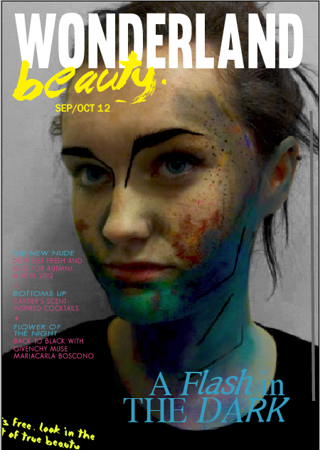
| This is the original image by music photographer Adam Elmakias. |
 |
| I took it into photoshop and started to add adjustment layers. |
 |
| I firstly removed the yellow tone by using colour balance. |
 |
| I then changed the levels which made the image look a lot darker. |
 |
| Finally I added a vibrance layer adjustment which makes the colour look a lot more saturated. |
 |
| This is the final image after using layer adjustments. |
Monday, 15 December 2014
Work In Progress
 |
| I firstly took the photo i wanted to used into photoshop and decided i was going to use a mainly monochromatic colour scheme with one colour to draw attention the background on my final magazine. |
 |
| I decided that i was going to use a collage of band logos, which meant i had to take each individual logo into photoshop and remove the background of every one. |
 |
| I then used 'command, shift, backspace' to fill the logos with colour. |
 |
| I then did this to the other 24 that are going to be used on the final cover. |
 |
| I then started placing my masthead on to my magazine along with the logos. |
 |
| This is all the logos placed onto my magazine to make a collage. |
 |
| Once i had placed the title, masthead, institutional information and the jack underneath the main masthead it was completed. |
 |
| This is my completed magazine using a mainly monochromatic colour scheme with one colour to make the logos stand out and to draw the attention of the reader. |
Sunday, 14 December 2014
Contact Sheet


I have taken a series of photos for my magazine cover. I have used ticks and crosses to decided if they could be used on my magazine cover or not, the ones with crosses next to them are either out of focus, too dar or the models pose was wrong. The ones with ticks next to them have a good light and are in focus and include a good pose.
Wednesday, 10 December 2014
Monday, 8 December 2014
Stencil Spray Magazine
 |
| I used my stencil spray portrait to create a magazine. I used contrasting colours of blue and orange. I also used ornamentation to draw your attention the the white space on the left of the page. I also used a jack for an amp to draw attention to the main masthead. I also used the logo of the band as a main splash for the magazine. I have included all institutional information in the bottom left of the magazine. |
Tuesday, 2 December 2014
Friday, 21 November 2014
Spray Paint Portrait
 |
| I have chosen a photo to spray paint which i will take into photoshop. |
 |
| Once i took it into photoshop i made them into solid shaped using shadows, there was two versions which i then printed and cut out. |
 |
| I then sprayed them by putting another sheet of card underneath. |
 |
| This is them after i finished spraying them. |
 |
| Once i took the 'stencil' off this is what the first one looked like. |
 |
| This is the other one without a stencil on. |
 |
| I then scanned them in and took them into photoshop where i removed the background, coloured them and then layered them on top of each other so that they had detail on them. This was then complete. |
Saturday, 15 November 2014

Friday, 14 November 2014


Thursday, 13 November 2014
John's Awful Card


This is my final business card. To make a better business card i have used contrast, alignment, repetition and proximity to make it effective. I have used extreme contrast between the style of type and also the size of type and there is also contrast between black and white. I have used a left alignment on my card that is followed all the way down. The repetition on my card is included in the spacing of type and also the use of the sans serif type for the other information. For proximity i have grouped all contact information together and then the company and the person.
Double Page Spread Copy


I have created my double page spread in both indesign and photoshop. I used photoshop to create the shattered mirror/ broken effect on the photo.

Wednesday, 29 October 2014
Monday, 29 September 2014
No Staples Book
 |
| Firstly, I had to draw my designs out individually and then i went overt them in biro, fine liner and then black felt tip pen. |
 |
| After this I scanned them into the computer, then placed them in photoshop and got rid of the background and changed the line using the magic wand tool. |
 |
| I then added the pieces to my plain book design and coloured them in white for the poster. |
 |
| I did the same for the main part of the book afterwards and also added text. |


 |
| After printing my no staples book out, i cut down the middle half of the book and folded it to make the book. |
Subscribe to:
Comments (Atom)